Showing posts with label mapping. Show all posts

Sunday, February 22, 2009

Spatial Technologies and Natural Hazards - Bushfire Mapping

I have been a little hesitant about posting on the Victorian Bushfires until now, simply because it was all too sad and too real here in Victoria. As a teacher, and particularly a Geography teacher, it was a topic that was spoken about in classes, but I really did need to think about what I was going to say, and how I was going to deliver this information. For most teachers in Victoria, and particularly Melbourne, we had students in our classroom who were either immediately affected, or knew someone who was affected by the bushfires.

I had Geography on the Friday prior to Black Saturday (7th February). I had no inkling of what was going to occur, but I was introducing the topic 'What is Geography?' to my students, so was showing them the Bureau of Meteorology site and the predicted extreme forecast for the weekend. We spoke about the weather conditions and why extreme fire danger was a real threat to most of Victoria. Following the weekend, a number of students recalled that discussion in class, and I did need to spend some time on it. The lesson was on 'Spatial Concepts', so the class was clearly able to identify spatial associations between Bushfire hotspots and the number of abnormally hot days in Victoria. It was a valuable lesson in the importance of Geography in everyday lives. The continuing news broadcast also displayed the importance of mapping and spatial technologies in both the fire fighting and recovery effort. Many of my students would turn up to school with footage from the news broadcasters that had topographic maps in the background, and online mapping tools as visuals.

So, in saying all of that, there are a number of interactive GIS maps out there on the internet that allow students to look at differing layers of natural hazard data. Following the Bushfires in Victoria, more of these sites emerged. Below, I have outlined some that I have used successfully in my Geography classes. My suggestion is to develop handouts for the students to complete as they look at these sites....

The World Natural Hazards Website provides a global view on natural hazards and disasters around the world. This site is structured like a true GIS based interactive map, allowing the user to turn on and off a number of layers. It also includes demographic data, infrastructure data and operates in real time. Using the Information tool allows the user to find out about specific hazards in specific regions. This site will not be as specific as more local or Australian based websites, but is great to have for the students when studying any natural hazards or disasters.


Sentinel Bushfire Mapping is produced by the CSIRO. This map provides an overview of the hotspots in Australia for the last 24 - 48 hours. The site has basic GIS applications and allows the user to turn differing layers on and off. This site has been inundated in the last few weeks, and therefore may be slow and a little bit out of date.


Google Victoria Fires Map uses RSS feeds from the Country Fire Authority to up-date the map. You can also look at the most recent satellite imagery from the fires. One of the reasons that Google Maps produced this site was to take the pressure off other CFA and Bushfire mapping sites. An article on the development of this map was written by CNet, Google Maps Track Deadly Australian Bushfires.


I found that the ABC News Bushfire Emergency Map, powered by Microsoft Virtual Earth, was also a great map to look at. This provided a little more detail on the human and infrastructure costs, and had links to current news events. This map was utilised by a number of people in the fire affected area. The ABC News site is also one of the best in terms of information about the disaster.


Using satellite imagery is, I believe, the best way to explain the extent and nature of a natural disaster such as bushfires to students. The NASA Earth Observatory is always my first port of call, providing excellent imagery as well as a detailed and easy to understand explanation of how the imagery was collected and what it shows. The most telling image would be the Image of the Day on February 5th - Exceptional Australian Heat Wave, February 10th - Bushfires in South East Australia, February 14th - Bushfires in South East Australia and February 18th - Killmore East-Murrindindi Complex South Fire, Victoria.

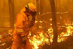
I hope these sites are useful! If you know of any others, please comment. The image of the fire above was taken from d200dug on Flickr.

Tuesday, January 20, 2009

Google Street View: People Might Be Watching

Google Street View would have to be one of the most exciting and controversial developments in mapping software at the moment. When Street View was launched in August, 2008 (the map to the left shows Street View coverage in Australia) there was quite a bit of controversy over the privacy issues. Articles including 'All-Seeing Google Street View prompts privacy fears' from Times Online and 'Google Zooms in Too Close for Some' from the New York Times, indicate the main privacy issues. There are also a number of sites and blogs now specifically related to the quite private (and funny) images that Street View can produce. One such example is Street View Fun, a site where contributors can upload the latest funny and interesting Google Street View Photos. Uploaders to You Tube have also jumped on the Street View bandwagon, this posting 'Part 1 of 'The Googling' by a group called The Vacationeers, is one of my all time favourites.


Google Street View does have competition. Since it waltzed onto the spatial technology scene in spectacular fashion, a number of other similar applications are now available. These include Mapjack (picture above), City8 (invented and launched in China 1 year prior to Google Street View), iiCosmo (developed in Japan), Earthmine (developed for private companies and involved in 3D modelling for NASA) and EveryScape. Of these, Earthmine did catch my attention due to the sophisticated nature of the software. Check out the site and the posted news articles. Also, EveryScape was interesting as it is based on the tourist industry, and allows the user to investigate inside buildings and major tourist attractions. The You Tube post of the EveryScape launch is below.


I am sure that you can see the applications these street view sites have for us in the Geography classroom. I have often used Google Street View as an introduction to Geography or mapping in junior classes (a new twist to the standard Year 7 'map your neigbourhood class activity') and it is invaluable when looking at human environments and town planning in senior geography. Now that I have discovered EveryScape, any tourism studies can now be enhanced. In essence, *almost* any location you study or discuss in class, can now be viewed in a whole new way.

For those who are the more technically minded among us, check out the Official Google Maps API Blog. This will explain, in some detail, how to embed a Google Street View Panorama onto your own blog or website (or even your school!). Information and a demo on how to do this is provided for you.

Monday, January 19, 2009

What Really Is Geography These Days?

Yesterday I began planning my first semester of Year 11 Geography. I have allowed the first week to introduce and discuss the idea of 'What Geography is?' before launching into a study of natural environments. Introducing the concept of what geography actually involves is quite different to when I was at high school, or university, or even when I first started teaching.

This is due to the fact that geography and location has become such an important part of organising information on the internet. Rather than searching for a fish and chip shop in the yellow pages, you go to Google Maps, type in 'fish and chip shop' and see which are closest to you. At a recent conference, the keynote speaker quoted that 80% of all information on the internet is now organised spatially. This will only increase as more and more data is added.

An example of spatial organisation of data is a site called '80 Million Tiny Images'. This is a visual (and spatially organised) dictionary of all nouns in the English language. The nouns are arranged by semantic meaning; they are clustered according to broad categories such as plants or people, and then tighter groupings such as flowers or trees. These semantic groupings allocate their spatial location on the page. The creator even uses the word 'map'. A large number of images are then linked to each word. Simple click on the 'map' and the word with associated images will appear. You will notice that they are clustered together according to spatial location and relationships, rather than alphabetically.

Another example is a site that has been put together by marumushi. Marumushi is a design engineer who has an interest in playing with and visualizing lots of data. His site 'Newsmap' is an application that visually reflects, according to category and location, the changing landscape of world news. The map dispalys and reveals patterns in news reporting across countries and the the nature of the most popular headline at the time. This site is great to use in senior geography, to discuss events that have occured, if they have been reported on, and by which countries. You are able to look at a global view, or specific countries such as Australia, the US and the UK. The differing colours on the site represent different news categories, and the larger the writing, the more it appeared in news headlines.

Finally, a third site that organises data and information in a spatial way is 'Buzztracker: World News, Mapped'. Buzztracker is a software that visualizes frequencies and relationships between locations appearing in global news coverage. It is also great as it shows how interconnected the world is. "Big events in one area ripple to other areas across the globe. Connections between cities of thousands of miles apart become apparent at a glance". You will need to remember however, that this site only tracks English-language news sources. A link is provided to add buzztracker to your own site, something to think about putting onto your Geography blog or wiki at school.

These are only three of the many tools that allow you to search or organise information according to spatial location. Others include Tag Galaxy, Arc, Kartoo, Flickr, News Spectrum, Bigspy, Stack, Swarm, Think Map Visual Thesaurus, Google News Cloud and Searchme Visual Search. These are all great sites so take the time to check them out.

The You Tube clip below was a great example of the way in which many of the tools listed above represented the Iraq War. Have a look...


So, to introduce my class to Geography I will use my stock standard content and activities. But I will also emphasise the role of geography and location in organising information, the role geography plays in our everyday lives, and how we are becoming more and more reliant on spatial organisation of information.

That should get some minds thinking.....